Reach
Re-designing the platform to help organizers and volunteers connect better.
COMPANY OVERVIEW
Reach is a skills-based volunteering charity platform and the UK's single biggest source of trustees for the voluntary sector. Reach operates primarily through their website but has a responsive mobile design that connects organizers and volunteers.
OVERVIEW
With the rise of new technologies and design trends, Reach's platform was due for a refresh. This project aimed to not only give the platform a much-needed facelift but also to explore user pain points in-depth through extensive research. Our team of 5, after collaborating on the findings, split into focused groups to review and redesign specific roles: one focusing on the organizer experience, the other on the volunteer experience.
The goal of this project is to create a new user-friendly layout for Reach's platform that solves user frustrations.
DURATION
5 Months
TEAM
Kit, Head of Design
Gloria, UX Designer
Jeff, UI Designer
Claire, UX Designer
Alexis, UX Designer
UNDERSTANDING THE USER
Due to the project's complexity and Reach's wide-ranging audience age (from 20 to 60+), we conducted various research methodologies to fully understand our users' needs and frustrations. This ensured the new design would be accessible to all ages while maintaining Reach's branding.
QUALITATIVE RESEARCH
We conducted 16 user interviews, with 6 of them being guests, 5 being volunteers, and 5 being trustees. The guests were questioned about their needs, frustrations, and motivations as either a volunteer, someone interested in volunteering, or a trustee.
In addition to this, we also reviewed all the service emails we received from our users.
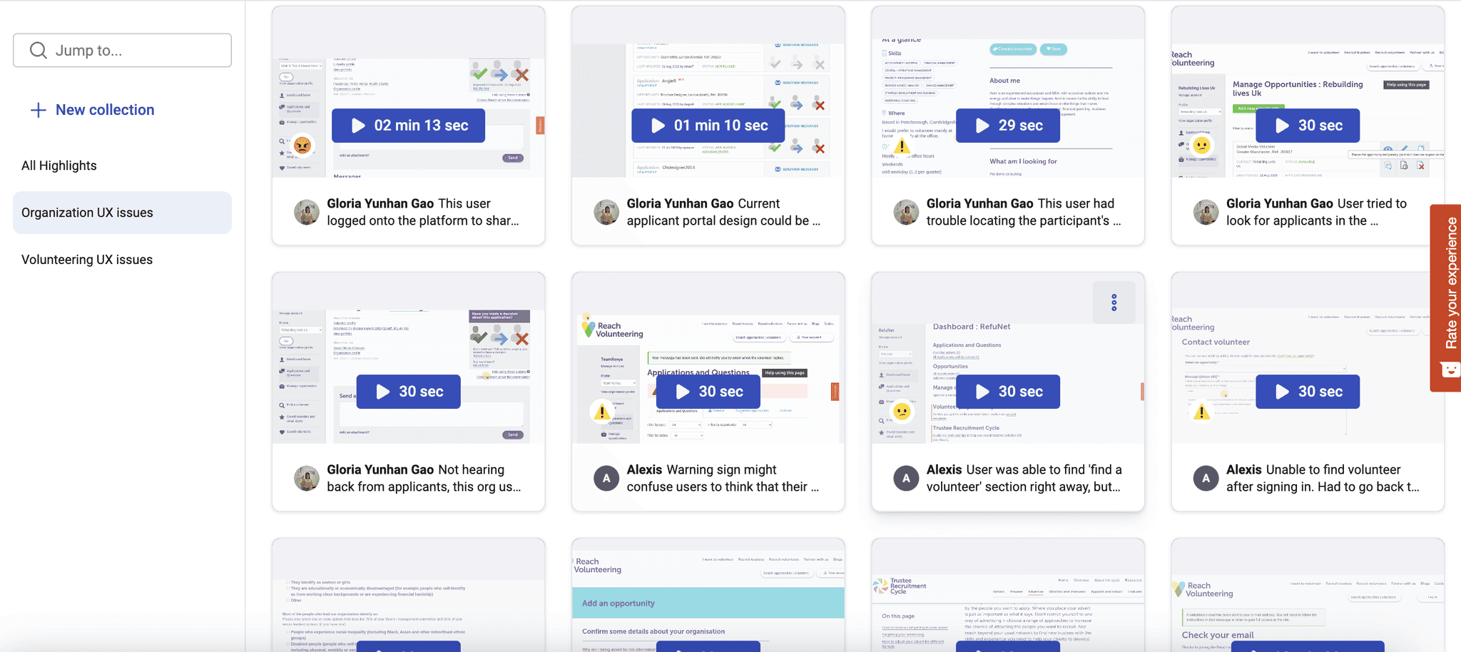
After conducting the research, using dovetail we grouped these data to identify key patterns such as common pain points, ideas and motivations.
QUANTITATIVE RESEARCH
Using Hotjar, we used session replays, heat maps and funnels understand how our users navigate through the site and see whether they reach the happy path. We dedicated a week to completely understand all the data we've gathered during this research.

EMPATHISING WITH THE USER
Following our research analysis, Gloria and I were assigned to address issues within the organization section, collaborating on a new user flow based on Reach's personas.
THE PERSONAS
Reach has 10 personas, and each of these personas has different challenges and reasons why they use our platform. To redesign the platform successfully, we needed to get into these personas' perspectives and identify their needs, struggles, and motivations, as the whole layout will be based on these personas and our newly found data.
As our focus was specifically on the organization section, we prioritized five key personas for the user flow redesign: Proactive/Value Volunteers, Trustees Recruiting Trustees, Platform Strugglers, Jobs Boarders, and Drop-Outs.
PROACTIVE/VALUE VOLUNTEERS
Background:
Leader of a small/mid charity.
Leverages support for charities.
Used to work for larger charities.
Is ambitious.
Motivations for using reach:
Wants to bring in expertise that she can afford.
Specialists help.
Challenges
People don’t follow through with communication/ they leave.
Admin involved with maintaining profile.
TRUSTEE RECRUITING TRUSTEES
Background:
Financial auditor
Recruited to the board via a friend who was involved.
Believes in cause and likes that he can direct influence/ benefits from his involvement.
Motivations for using reach:
Looking for experience outside of social network/ circle.
Wants a skilled trustee.
Challenges
Confusion around process.
Not a tech savvy.
PLATFORM STRUGGLER
Background:
Been in organisation for a long time, seen organisation through different transitions.
Been in same field for a long time, used to a certain way of thinking.
Doesn’t use social media/ internet much or engage online. Finds it overwhelming.
Motivations for using reach:
Looking for a trustee or key role – might be desperate/ struggling to find this person.
“Moment of crisis” and then have to engage with the service.
Challenges
Which button to press e.g. update an application/ send a message.
Their knowledge about recruitment doesn’t translate onto website.

JOBS BOARDER
Background:
Volunteer coordinator for large charity.
Mid 30s.
Registers roles, one in every location.
Motivations for using reach:
Access to candidates.
Free service.
Challenges
Inconvenient admin (updating statuses).
Unable to attach registration form to role.
Volumes low in other regions.
High drop out rates.

DROP OUTS
Background:
Senior position/ not used to admin type work.
No dedicated HR person/ not much resources.
Is a “Drop out” because they register roles but doesn’t reply when they get applications
Motivations for using reach:
Used other jobs boards/ heard of Reach.
Likes calibre of Reach volunteers.
Challenges
Too much admin and irritated with admin post application.
Information overload and lengthy process/
USER FLOW
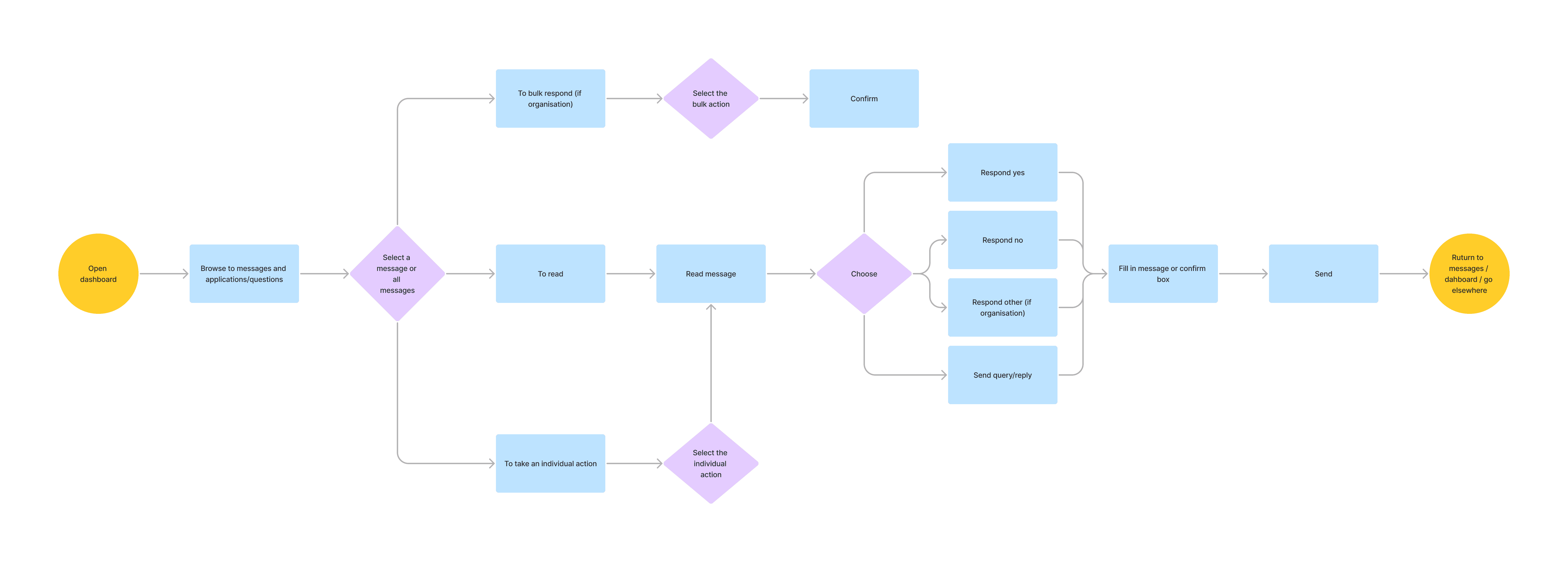
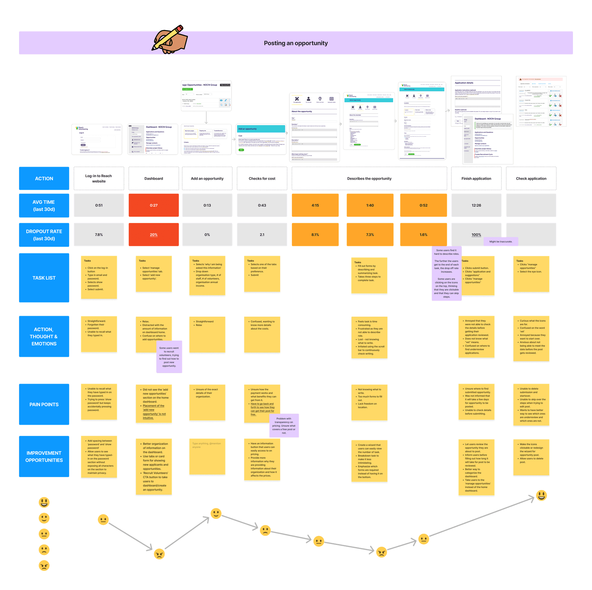
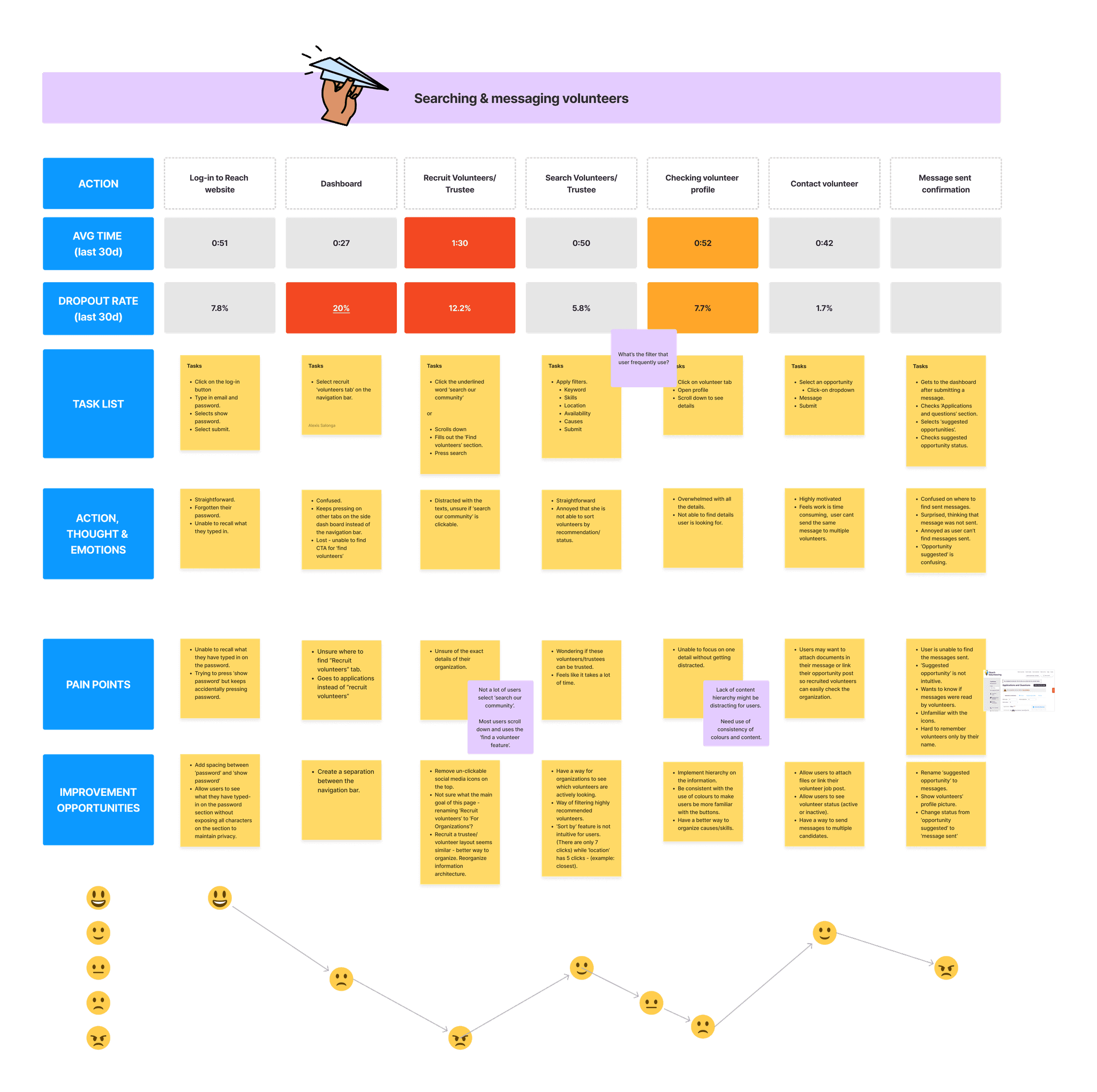
Reach prioritized two main personas for organizations: Proactive/Value Volunteers and Trustees Recruiting Trustees. Gloria and I each selected one of these personas to analyze their user journey and how they would complete a specific task on the platform.
I chose the "Trustees recruiting trustees" persona and created a user flow for posting an opportunity, searching for, and managing volunteers.
KEY INSIGHTS
After analyzing the data, our team identified three common values that we want our users to feel and see when interacting with our platform:
CONFIDENCE
Volunteering can be stressful for both organizations and volunteers. Therefore, it is important to provide only necessary information for users to promote independence so they can navigate through the page confidently, thus preventing information overload.
FAMILIARITY
Users need consistency with the design elements within the page, so they can become familiar with each icon, color, and button. This familiarity allows them to complete their goals with ease.
EXCITEMENT
Volunteering and finding volunteers is rewarding. Users should feel excited and free when applying to be volunteers, rather than feeling overwhelmed.
DEFINING THE PROBLEM
make organizing applicants/applications enjoyable for users?
make sorting applicants/applications less stressful?
allow users to navigate through the page easily?
IDEATING SOLUTIONS
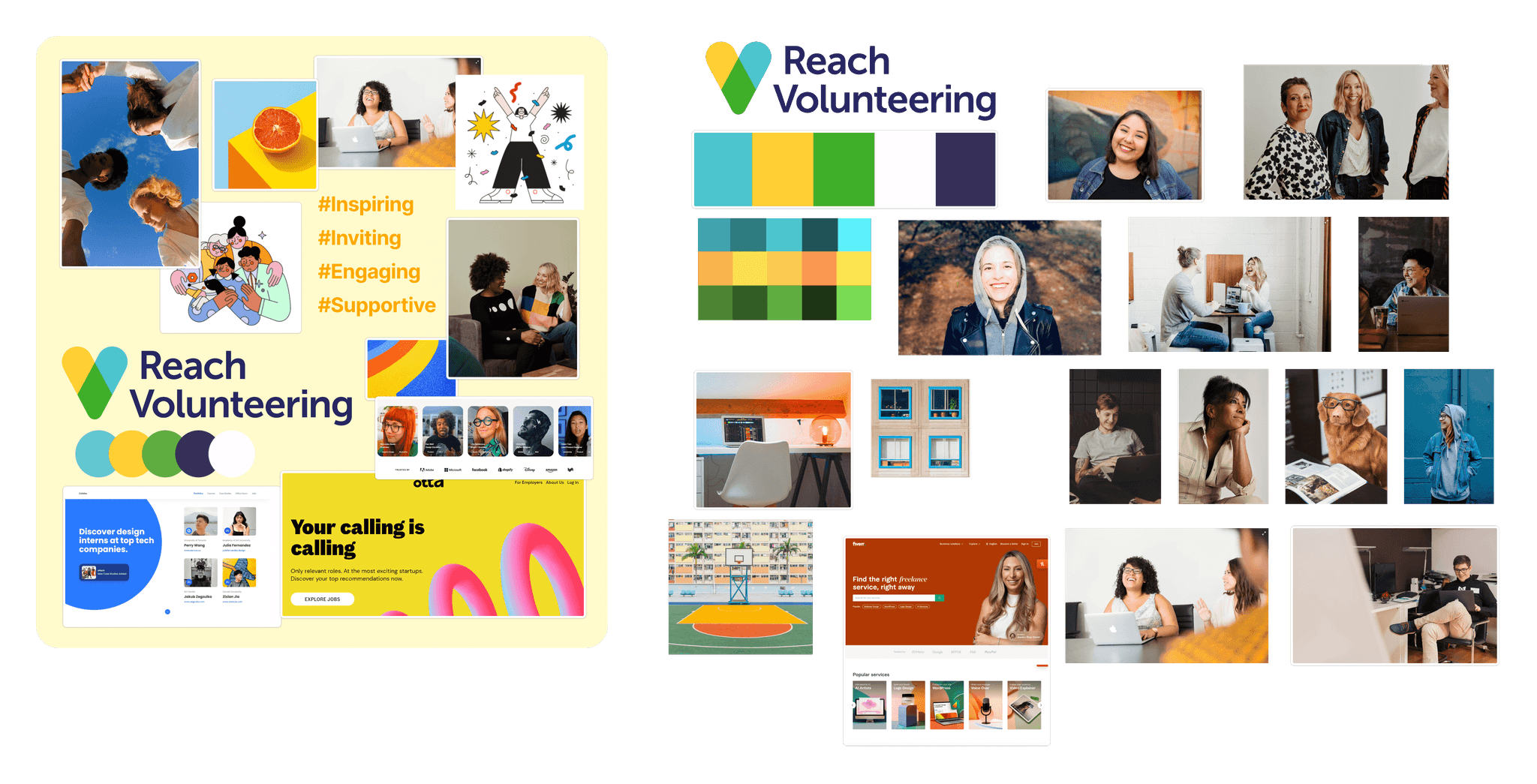
To translate our understanding of user pain points, motivations, and behaviors into a tangible vision for the Reach platform, we created a mood board that would embody the desired user experience.
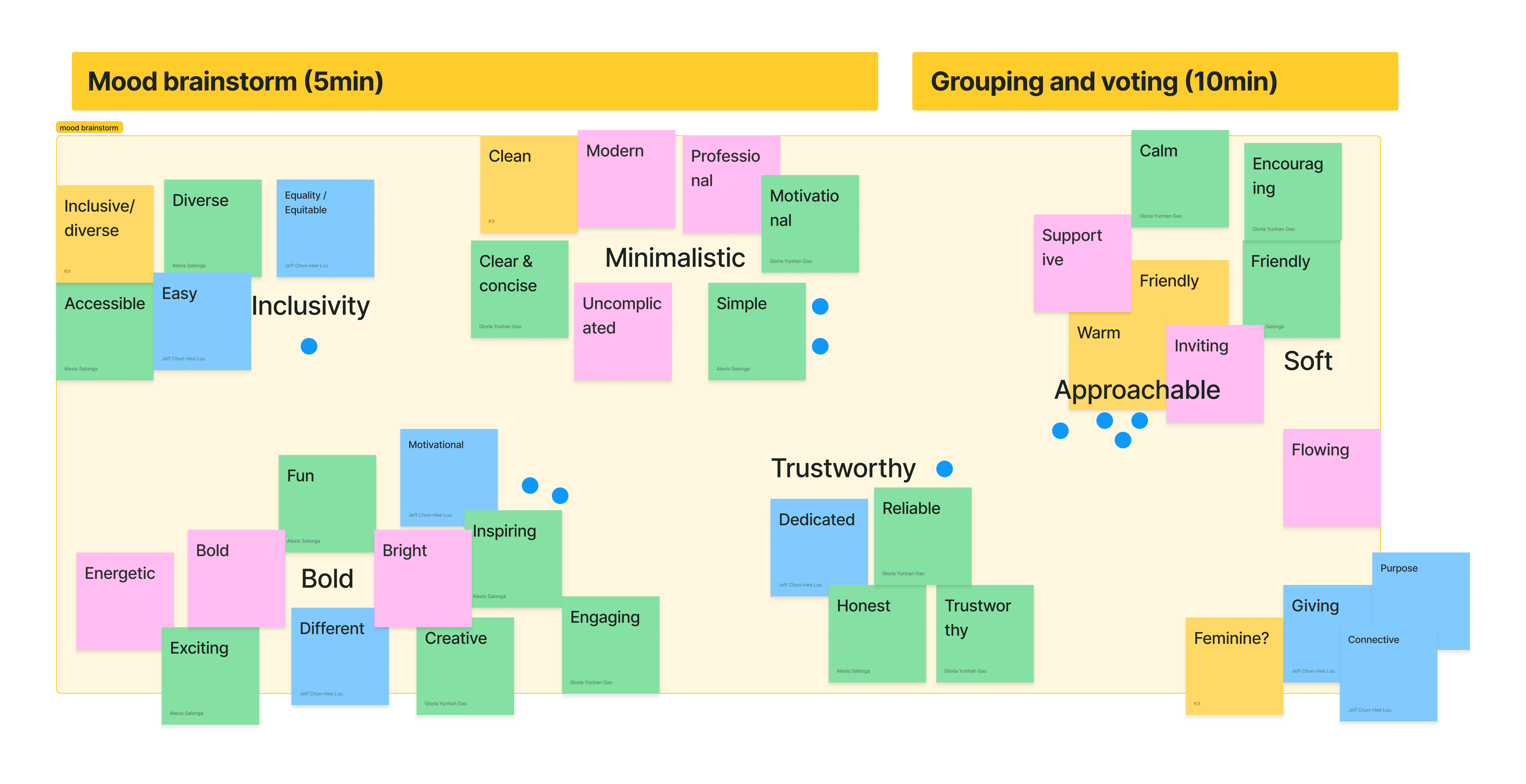
We held a workshop to build Reach's vision board. Each team member started by listing words reflecting their ideal user perception of Reach. After 10 minutes, everyone voted on the two most relevant terms.
The winner: Approachable
We divided into two groups and spent 15 minutes crafting mood boards, incorporating elements like photography, illustrations, colors, interface snippets, typography, and iconography that reflected our vision for Reach's brand and platform. So, here's the final moodboard:
WIREFRAMING
Coming up with an understanding on what we want our users to feel when they use our platform, the team then started create lo-fi wireframes.
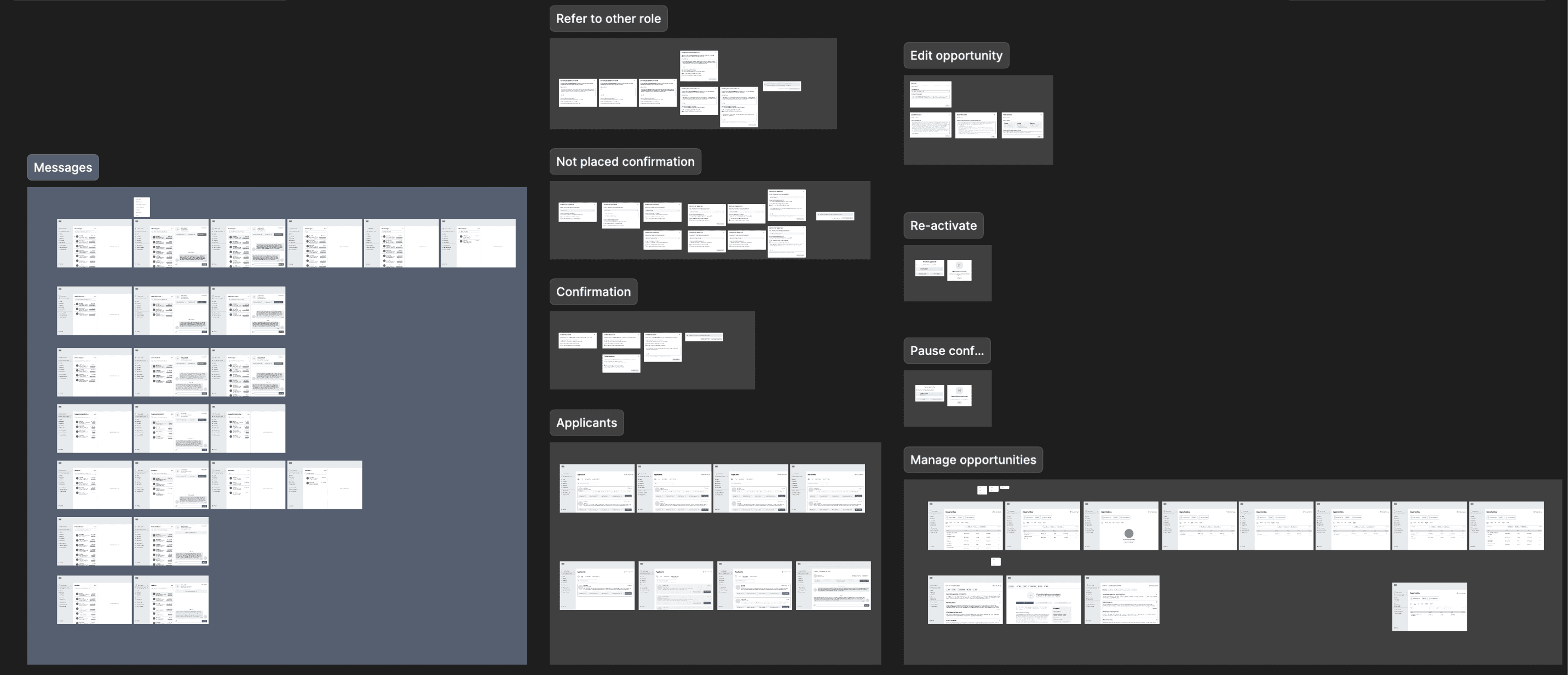
I was assigned to create mockups for messaging volunteers, managing applicants, including placing, not placing and waitlist scenarios, managing opportunities including pausing, re-activating and editing opportunities, and lastly, placement dashboard.
TESTING LO-FI WIREFRAMES
After creating the lo-fi wireframes, our team conducted a moderated usability study on these wireframes to ensure that we are on the right track for these designs.
Collaboratively, the team contributed on writing the test scripts for both organisation and volunteer scenarios. Kit, head of design, conducted the moderate study with 11 participants who joined this study.
Post-testing, the team spent three days compiling all new insights and pain points observed during the usability study into a single document for collaborative discussion.
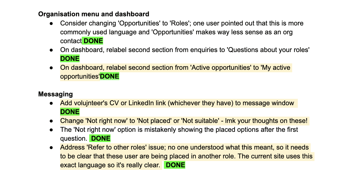
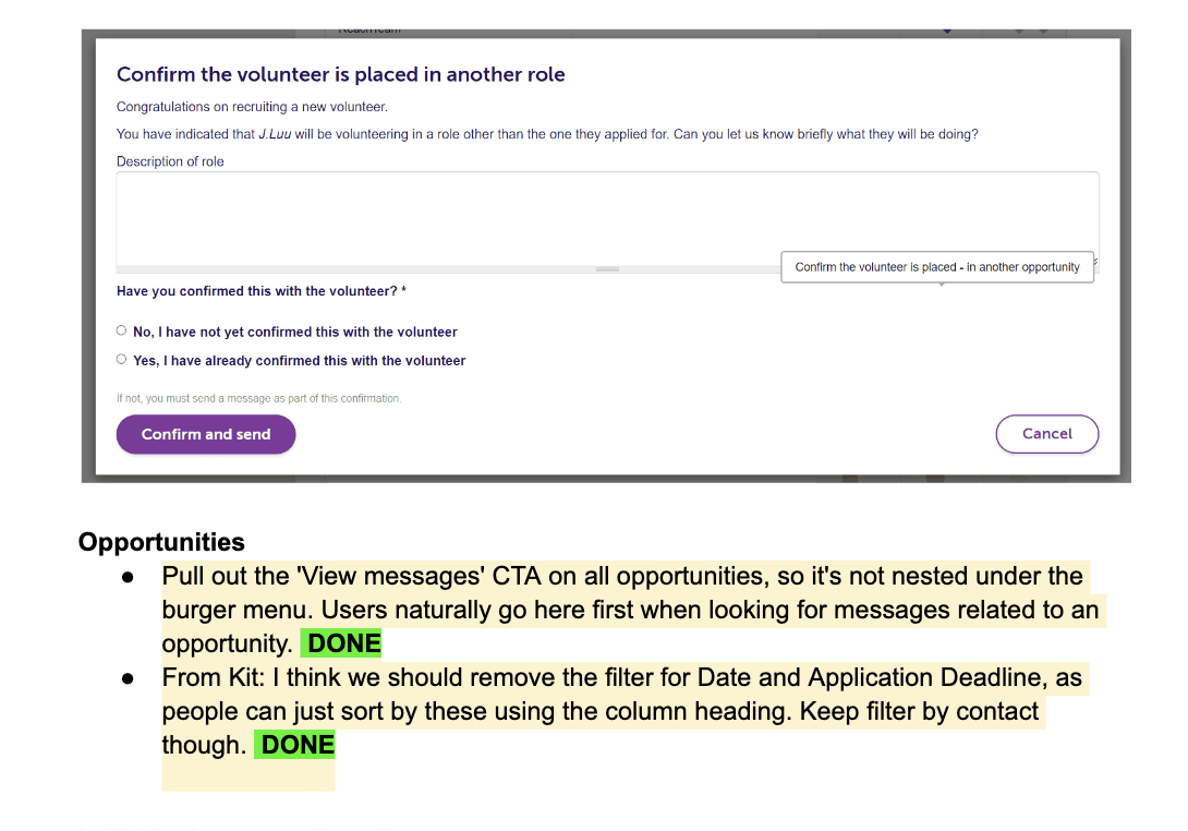
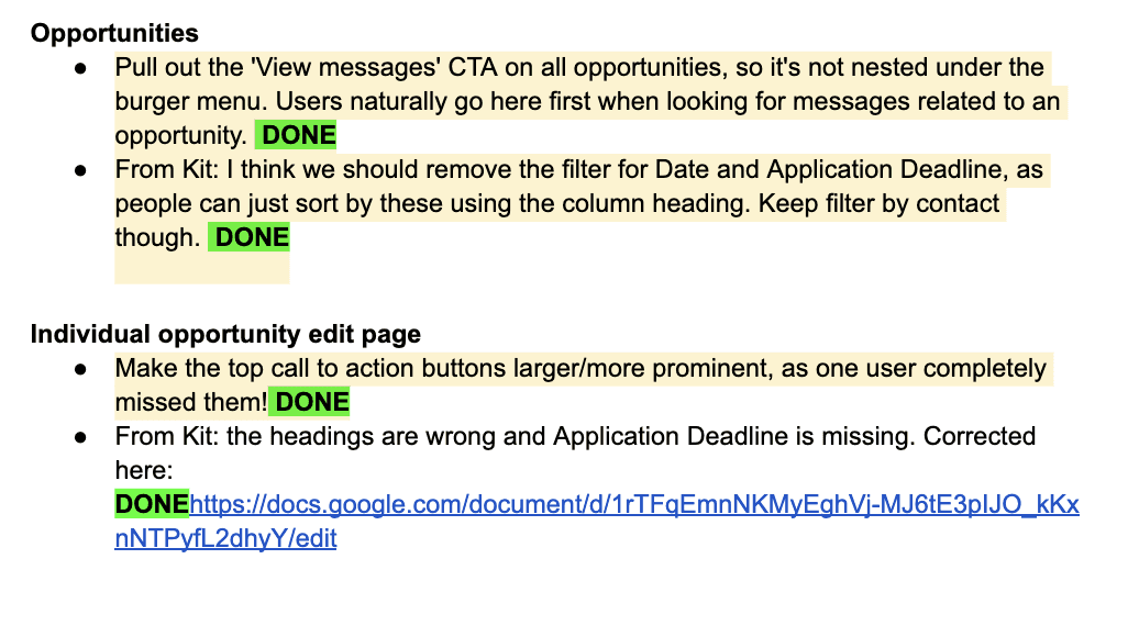
Subsequently, we documented these issues and assigned ownership for necessary iterations. My assigned tasks included:
CREATING HI-FI DESIGNS
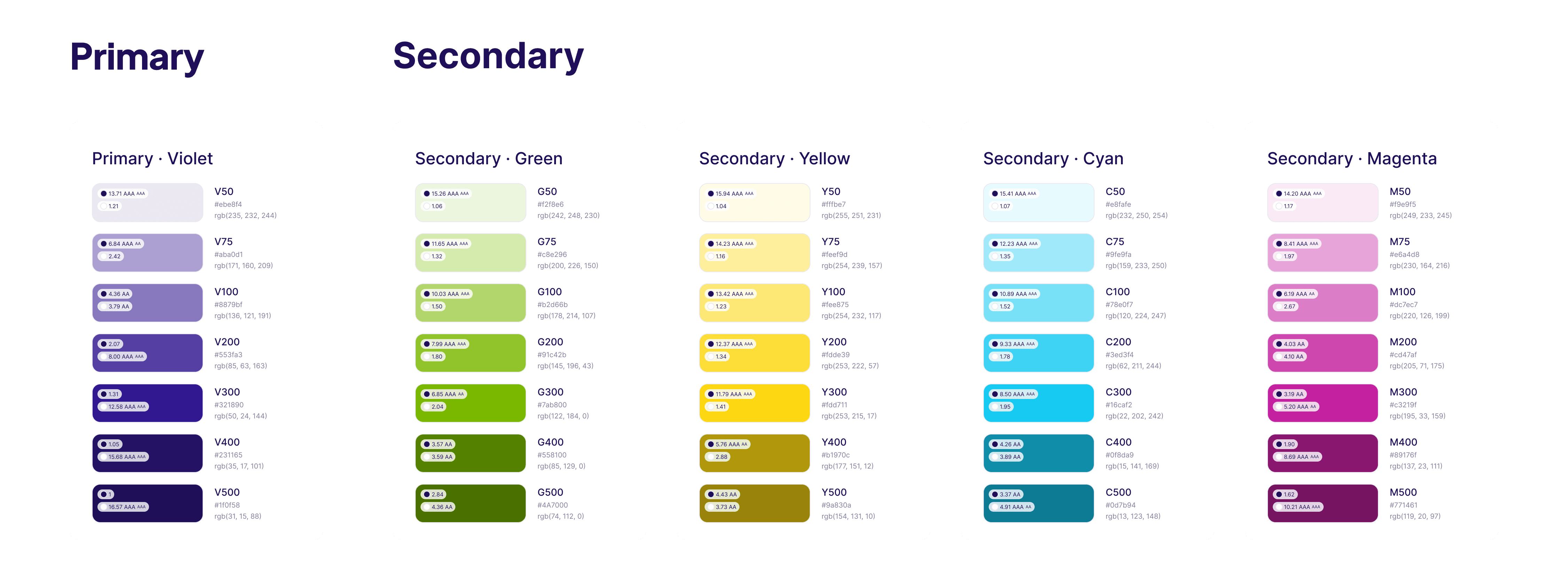
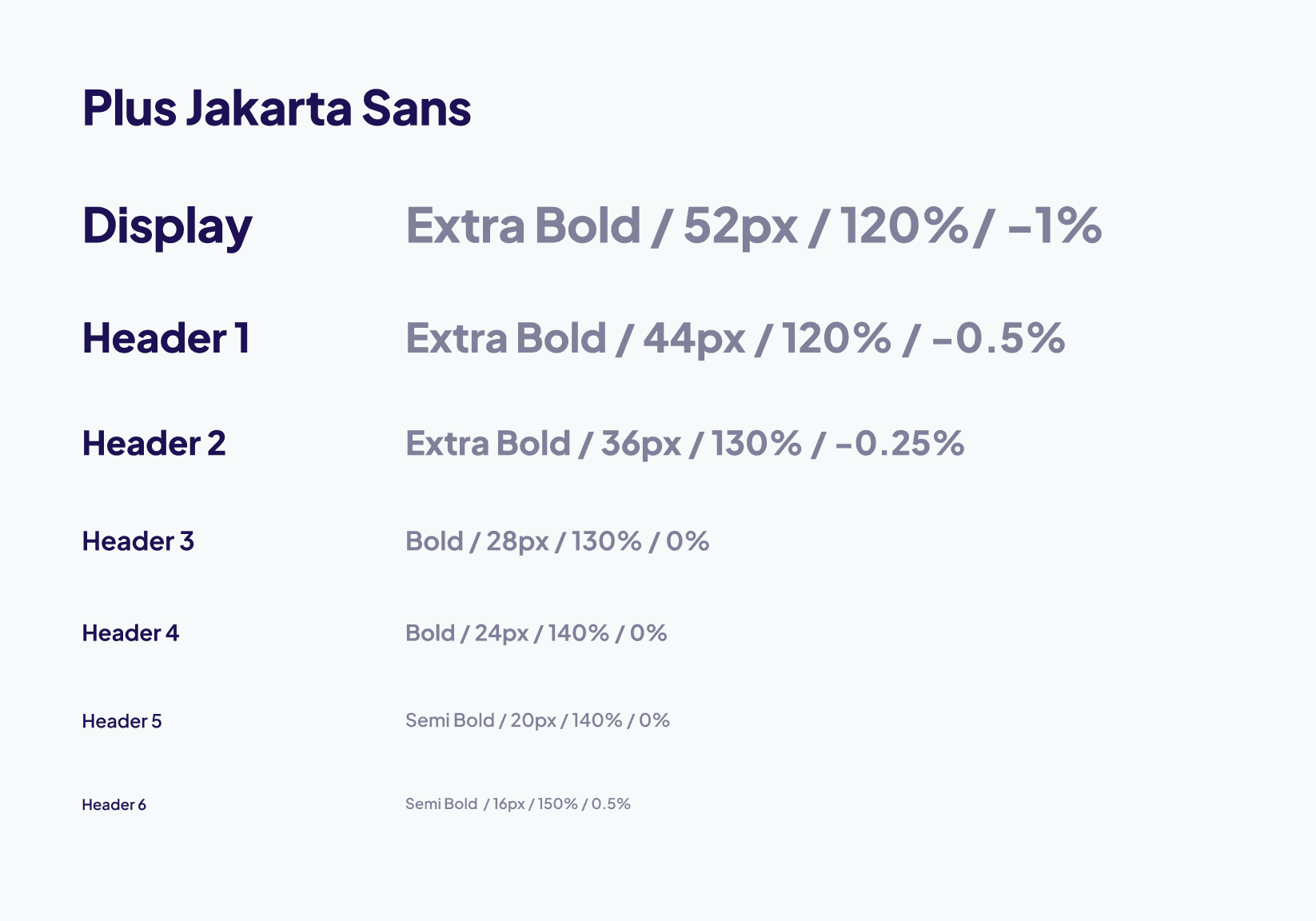
We built a comprehensive design system to serve as the foundation for the new platform. The images below offer a glimpse into this system, though its full scope warrants a dedicated case study.

SNEAK PEAK
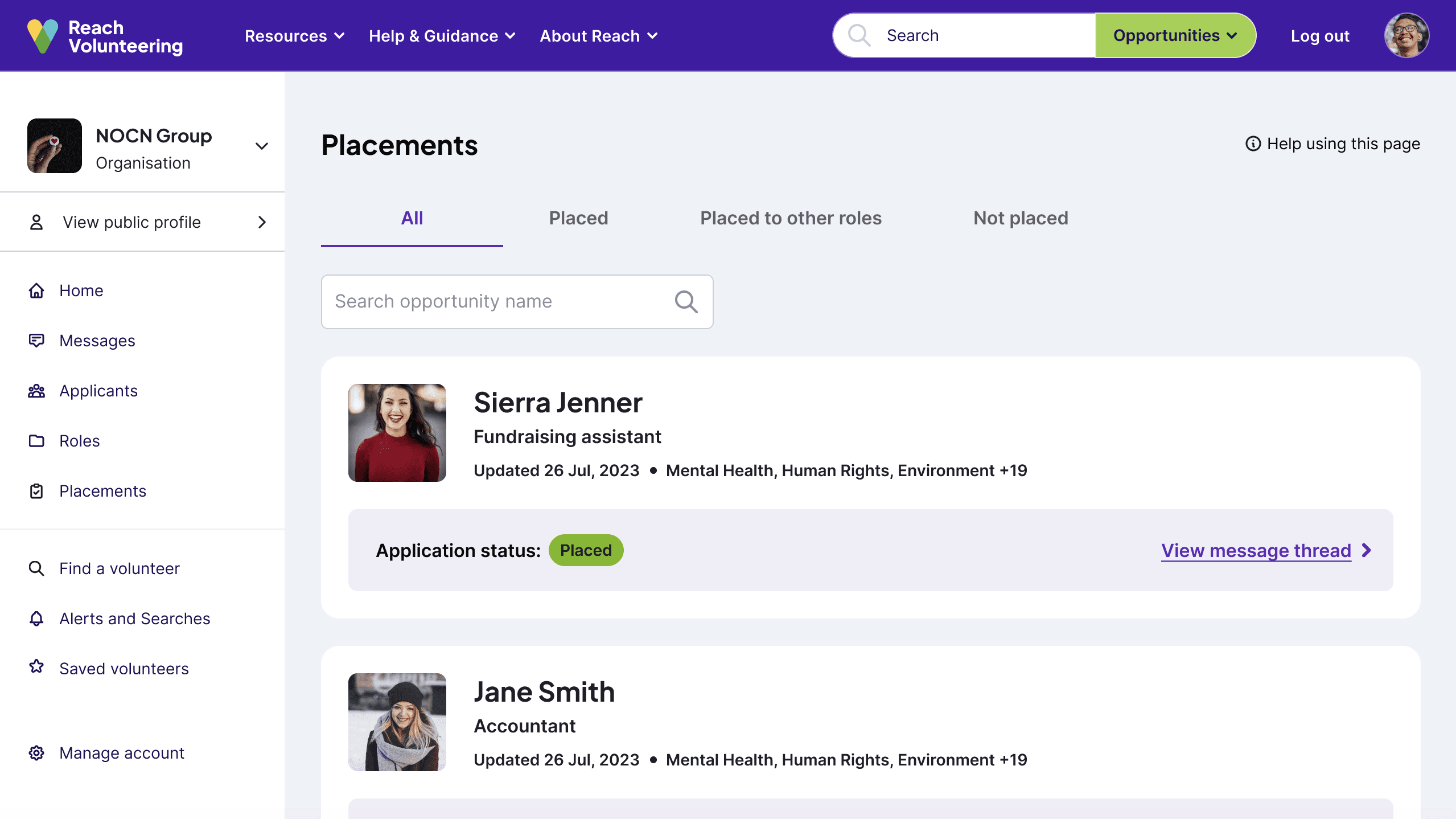
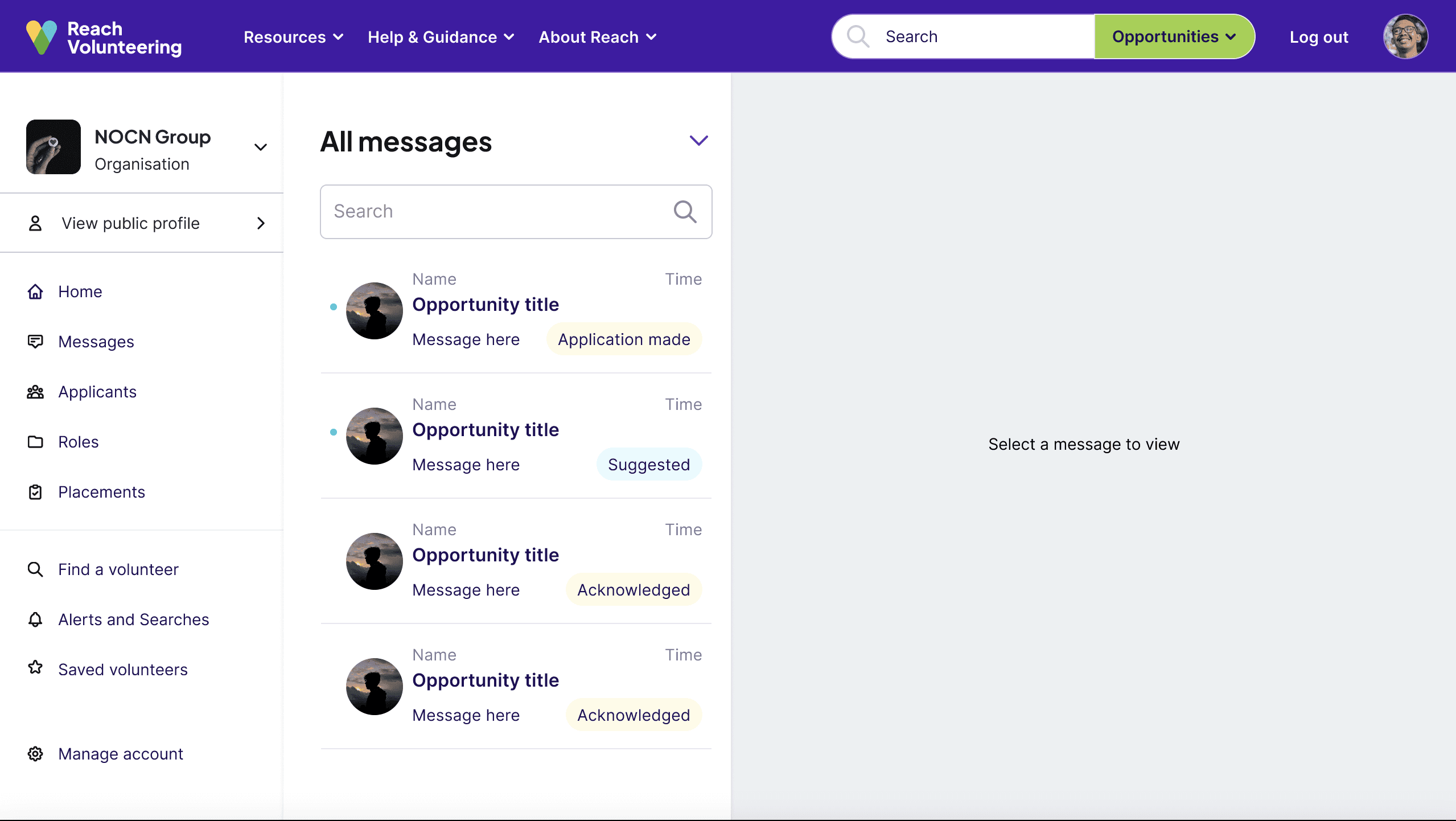
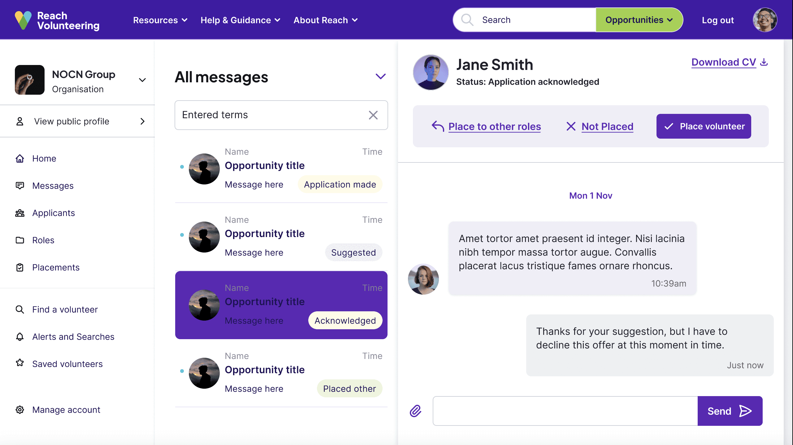
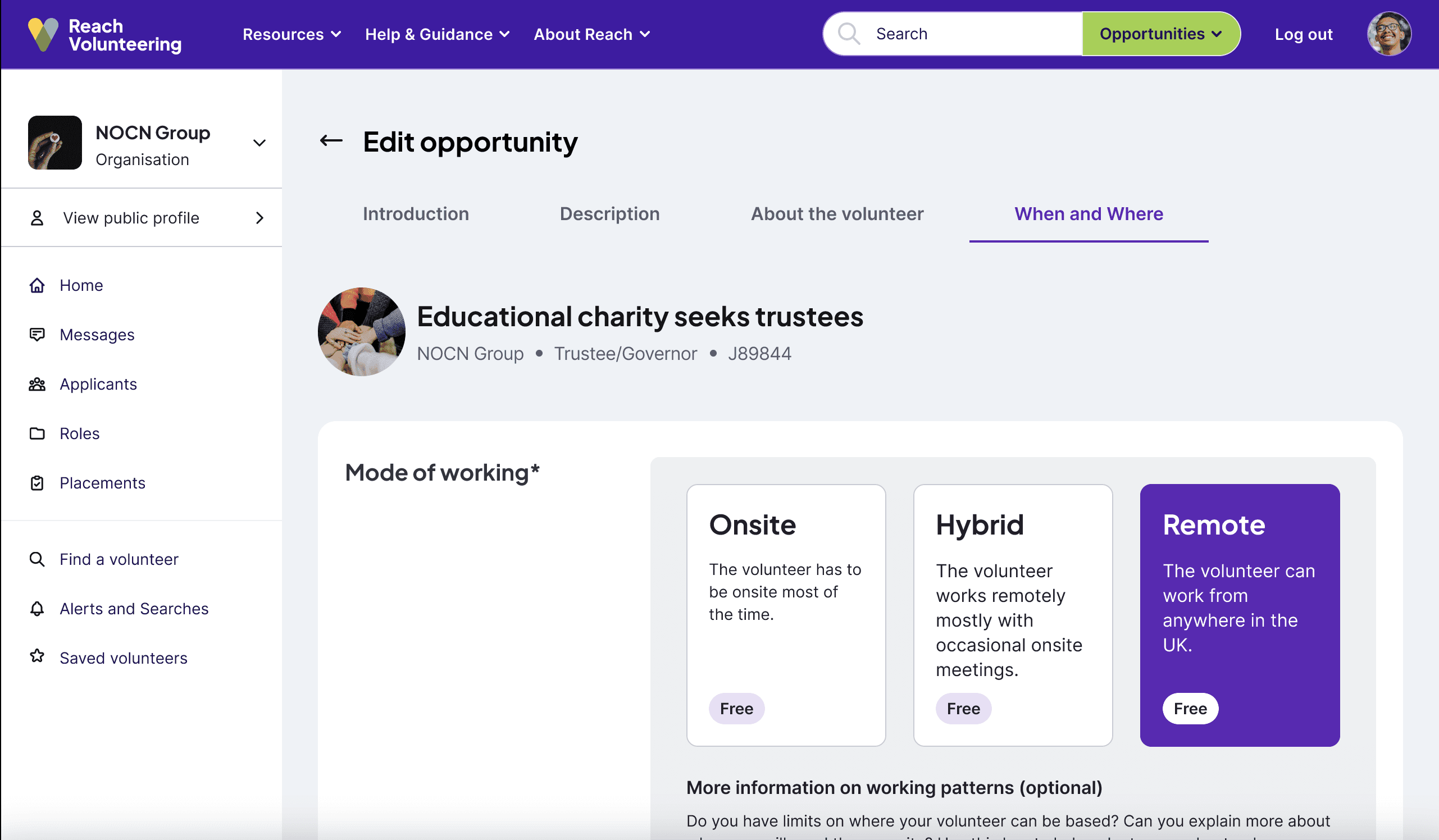
The new platform is still under development, with no official release date announced yet. In the meantime, enjoy this sneak peek of the revamped layout:
RESULTS & KEY TAKEAWAYS
Despite being in development, early lo-fi usability testing with long-term Reach users yielded positive feedback. Participants praised both the new layout and user journey, expressing excitement for the upcoming release.
This project was an incredibly motivating and insightful experience. Working alongside talented UX designers and being guided by a supportive and knowledgeable head of design pushed me to grow professionally. The challenges we faced encouraged our team to think creatively, collaborate effectively, and deepen our understanding of the UX design process.
I am excited to see this project come to life!


