Hopper Support
For a faster way of getting information and accessing customer service.
COMPANY OVERVIEW
Hopper is a travel app that helps users plan their trips. The app uses smart technology to tell users the best times to book flights, hotels, and cars.
OVERVIEW
This project aimed to identify and resolve usability issues within the Hopper app. In navigating the app, I noticed significant gaps in the help centre page that hindered users' ability to access and retrieve information, leading to user frustration and disengagement.
DURATION
3 Weeks
TOOLS
Figma
ROLE
UX Designer & Researcher
THE CHALLENGE
The objective of this project is twofold: to boost customer retention and to reduce support costs. To achieve these, I propose to design more intuitive pathways for users to independently access information and modify their bookings.
UNDERSTANDING THE USER
As a Hopper user, I decided to ask myself important questions to prevent myself from creating biases that can affect this study. With these questions in mind, I’ve developed 2 critical questions to understand Hopper users better.
How is having a help centre page on an app helpful?
Improves customer understanding
Inexpensive and time-saver
Provides convenience
Increases user trust
How is having a help centre page on an app helpful?
Users feel supported and heard
Promotes independence and confidence
Users feel in-control of the situation
According to travel news daily (2018), 60% of customers are more likely to switch companies after 1-2 bad customer service experiences.
Survey taken from www.travelnewsdaily.com by Tatiana Rokou
In an article from The Washington Post (2018), it validates customer feeling of pre-trip anxiety and stress due to inconsistent customer service and other factors.
Article taken from www.washingtonpost.com by Christopher Elliot
An article from Strategy Beam (2023) demonstrates how having a tailored FAQ section can improve sales. By addressing specific customer needs, it establishes user trust in the company.
Article taken from www.strategybeam.com by Chris
One in three (32%) say missing their flight is their biggest concern
Article taken from www.booking.com by Joseph Moscone
BASIC ONLINE RESEARCH
After fully understanding the importance of customer service, I conducted different methods of research and drew conclusions from these findings.
Despite its growing user base, Hopper has been unsuccessful in maintaining customer satisfaction. The common complaints found in these reviews include the inability to make booking changes, difficulty finding information, slow response times on the help centre page, or customer service in general.
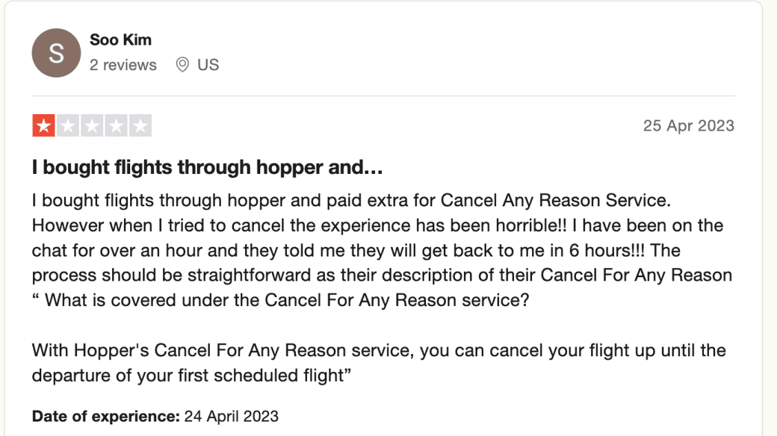
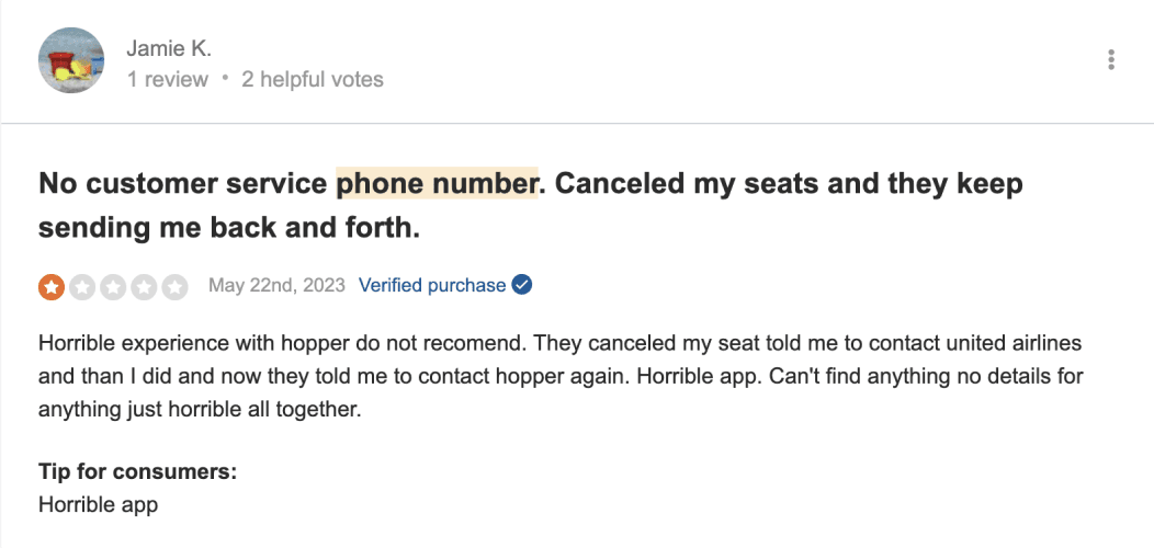

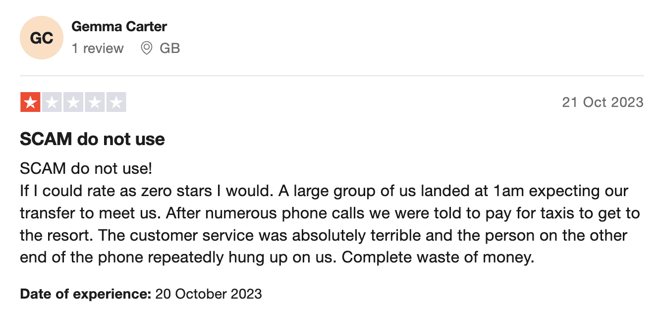
Images taken from TrustPilot.com
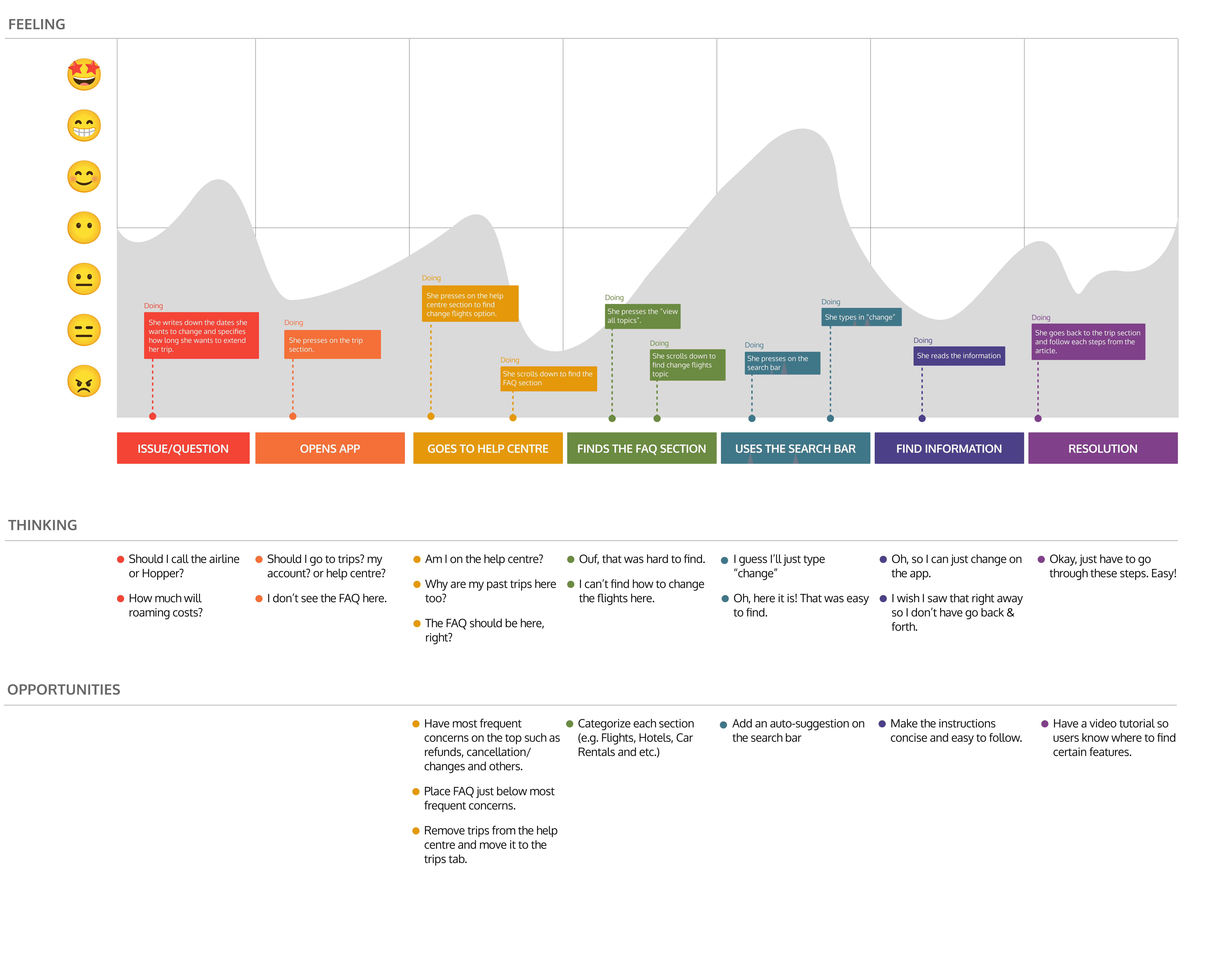
USER PERSONA & JOURNEY
Since every user is different, I decided to come up with defining characteristics to help me focus on the user’s support experience that may differ based on certain traits.

What makes a good day?
Finding information on the FAQ page.
Seeing the "change flight" option right away.
Personality
First Time Hopper User
Controllers, cut the chase
Goals
Do a solo backpacking trip in Asia
Have more time in the Philippines
Change flight date to Cambodia
Motivations
To check off her bucket list.
Discover and experience different cultures in Asia.
Fell in love with The Philippine culture and nature.
Frustrations
Unsure whether to contact Hopper or the airline about flight date change
Long wait time for a response from Hopper customer agents
Has limited roaming connection
What support tools do you use?
Goes through FAQs for basic questions.
Avoid talking to live agents as much as possible.
Julie's travel story
Frequent solo traveler Julie, having explored various cultures worldwide, realized during her Philippines trip that she hadn't experienced the country's natural beauty. Deciding to extend her stay, she faced a dilemma: contact Hopper or the airline directly to change her flight? Due to limited roaming and a preference for avoiding long calls, she emailed Hopper. As her original flight date approached with no response, Julie grew increasingly anxious about her travel plans.
Customer Type: Have they used Hopper before? Or is it their first time?
Support Tools They Use: What are their preferred ways of learning or gathering information?
What makes a good day: How do they currently interact with the Hopper app? What is working right now? Do they have any pain points while interacting with the app?
Personality: What problem-solving behaviours should be considered? For example, are they willing to be guided by a live agent? Or do they prefer to solve problems on their own? For my personas, I referred to these personality types.
COMPETITIVE AUDIT
After looking through the reviews online and empathizing with Hopper users, I've decided to conduct a competitive audit. This involves comparing the help centre pages of each competitor app to assess key features that enhance their user support experience.
I chose to look into Expedia, Kiwi, eDreams, LastMinute & Booking.com
I analyzed each competitor's support experience, looking at their strengths and weaknesses. While doing this, I considered the question 'How do users find information? Is it easy or hard?' and 'How many steps does a user need to take to get basic information? What happens if they require more help?'.
EXPEDIA
Offers different ways to contact customer service
Strengths
Takes only 3 steps to get to speak to live agents.
Necessary informations are easy to find.
Friendly and easy to use UI
Organized FAQ section
ChatBot is direct and easy to use
Weaknesses
Help centre is hidden on account section.
Overwhelming information on account section.
KIWI
Promotes independence in finding information.
Strengths
Easy to find basic information.
Direct access to live agents.
Allow users to navigate freely through the page without leaving the main page.
ChatBot is easy to use
Weaknesses
Has support and help Centre section. Slightly confusing on where to go initially.
eDreams
Addresses concerns through articles and FAQs.
Strengths
Help Centre section was easy to find.
Easy to find basic information.
It shows bookings that users may require help with.
Clean and easy to navigate UI.
Weaknesses
Search bar on FAQ is not working.
Takes multiple clicks/steps to get to ChatBot & Customer Service contact.
Unable to live chat customer service agents. Too much use of FAQ.
LastMinute
Easy access to live agents.
Strengths
ChatBot is helpful and easy to use.
FAQs are categorized (e.g. lights, cars, rentals)
Weaknesses
FAQs/Articles takes you to the website.
Users are not able to leave the app/screen while waiting for live agents to reply.
No way of seeing past conversations.
No much navigating freedom throughout the help centre page.
Booking.com
Message agents for more help.
Strengths
In-app messaging feature, allowing users to leave a message to live agents and see previous conversations.
FAQs are well-categorized by booking needs.
Basic information are easy-to-find.
Weaknesses
No search bar on FAQ.
Unable to determine when users are expected to get a reply from their message.
Manual entry of booking # and confirmation.
USABILITY STUDY
I conducted a usability study with five participants, who were either new or existing Hopper mobile app users. They were not required to have a flight or accommodation booked.
The goal of this usability study is to identify specific pain points within the help centre page as users navigate through it.
I asked participants to perform specific tasks such as finding basic information, going to the help centre and reaching out for help.
Find information about refunds or
cancellation policy
3 out of 5 users were unable to find information about refunds or cancellation policy intuitively.
Thinking: The FAQ section gets tucked in at the end of the page, making it inaccessible for users with present or past bookings.
Observation: These are old Hopper users who have present and past bookings with Hopper. Instead of going through the FAQ section, users went to their bookings, leaving them feeling lost and confused.
Start a chat with an agent
5 out of 5 users were unsure if their request went through the live chat.
Thinking: Lack of feedback creates an unsettling feeling, leaving users confused on whether their requests are being processed or not.
Observation: Most users felt annoyed, saying “So, what now? Do I wait? Or Can I leave the page?”, “How long should I wait?”, and some of them ended up giving up on the task.
Go to help centre page
3 out of 5 users couldn't confidently determine if they had navigated to the help centre page.
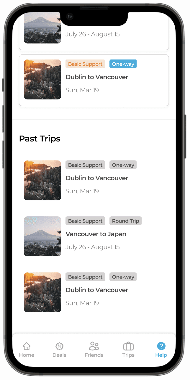
Thinking: The presence of past and present trip details on the help centre page leads users to believe they've navigated to a different section, rather than arriving at the intended help centre.
Observation: Most users felt confused on whether they are on the right page.
KEY INSIGHTS
From all the data I’ve collected, I started realizing some key aspects of user emotional, behavioural and functional needs to have a successful user support experience.
INDEPENDENCE
An FAQ section shows that a company is attentive and responsive to its customers' needs and concerns. It enables users to find solutions independently, often leading to higher satisfaction than requiring interaction with a support agent.
ASSURANCE
For users reaching out to customer service agents, immediate response and support are essential, especially if they are dealing with unexpected issues related to their travel. Providing prompt assurance can alleviate anxiety and foster trust in the service.
DIRECTNESS
Users require straightforward, clear answers when they navigate the help centre. Any unnecessary or complicated information could add stress, especially if they are already dealing with other travel-related concerns.
DEFINE
Based on the data and insights gathered from my research, I identified three main usability problems with the Hopper support page:
LACK OF DISCTINCTION
There is no clear distinction between the help centre and trip sections. The presence of past and upcoming trip experiences within the support page causes confusion for users about their current location within the app.
DISCOVERABILITY ISSUES
The placement and organization of the FAQ articles pose discoverability issues. Users may not intuitively scroll to the bottom of the page to find this essential information.
FEEDBACK ISSUES ON LIVE CHAT
The complete lack of feedback leaves users uncertain of whether their message was successfully sent or received. This confuses and dissuades users from using the chat feature.
IDEATION
Having identified the problems, I then devised several UX strategies (How Might We questions, brainstorming and wireframing) aimed at addressing these issues. In this process, I was careful to ensure that the proposed solutions were consistent with the key insights gathered during the research phase.
HOW MIGHT WE
give users more flexibility with their bookings
make finding information stress-free for users
provide assurance to users when getting help
INITIAL CONCEPTS
Since this is an independent project, the scope of brainstorming ideas is naturally limited. Nonetheless, by answering the 'How Might We' questions, I was able to develop several potential solutions:
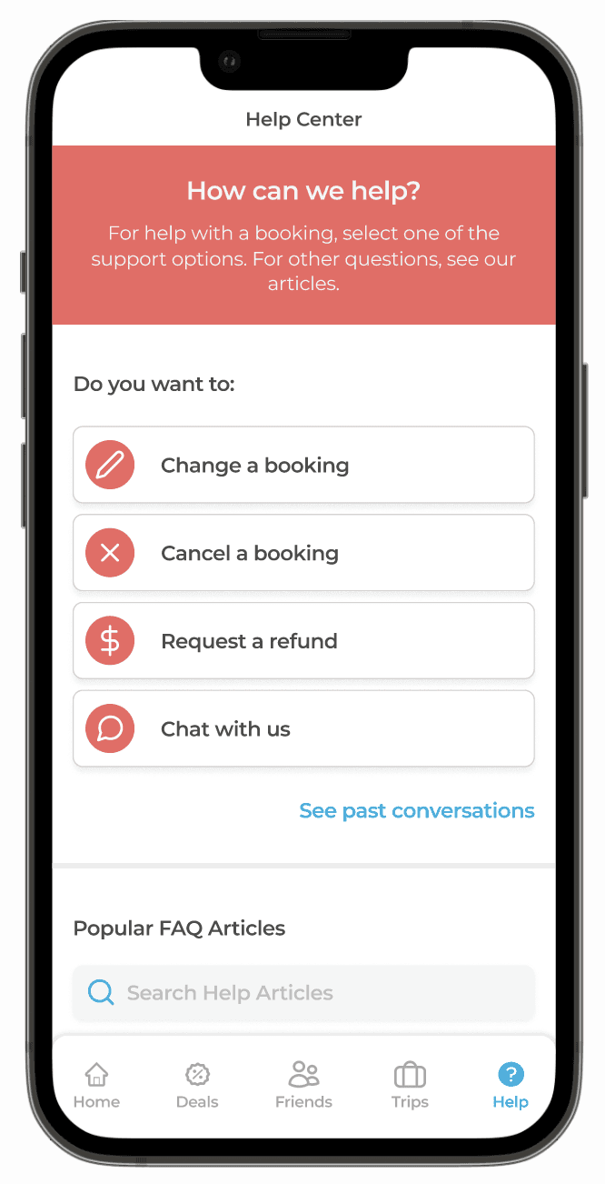
Positioning key help-request topics (like booking changes or refunds) at the forefront of the page for easier user access.
Establishing a cleaner interface by categorizing the FAQ section.
Retaining crucial elements from the previous design to maintain user familiarity with the interface.
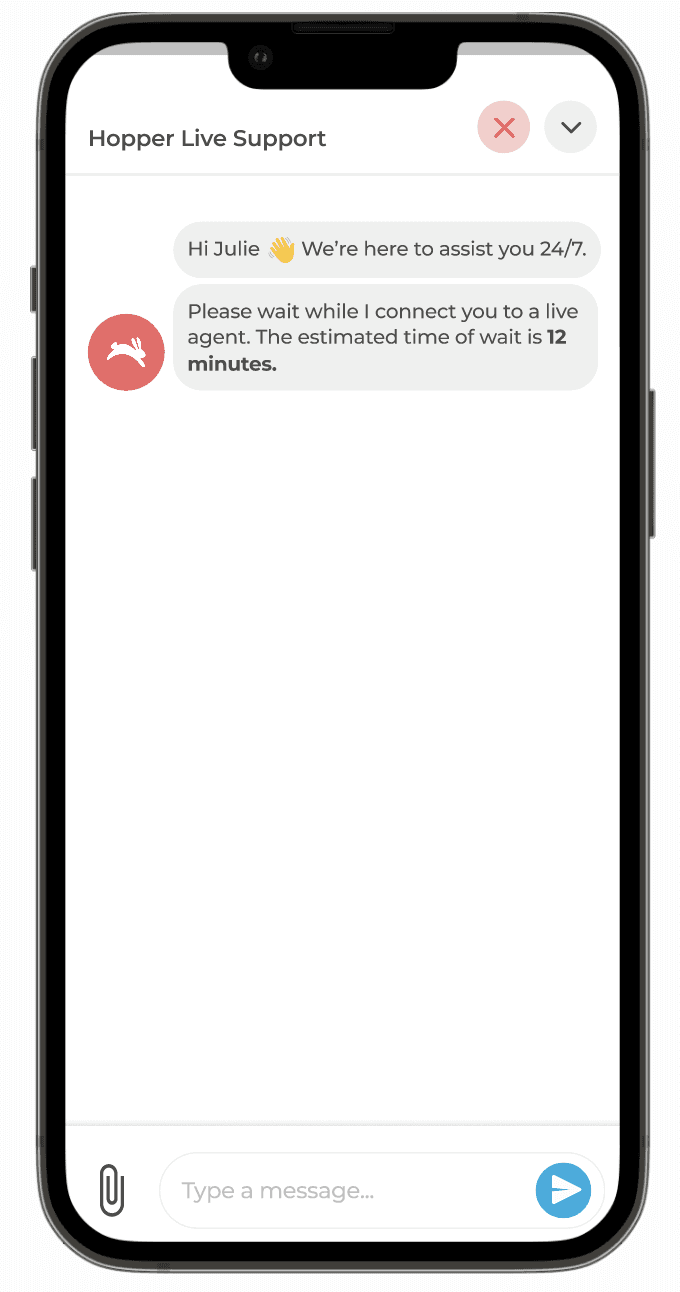
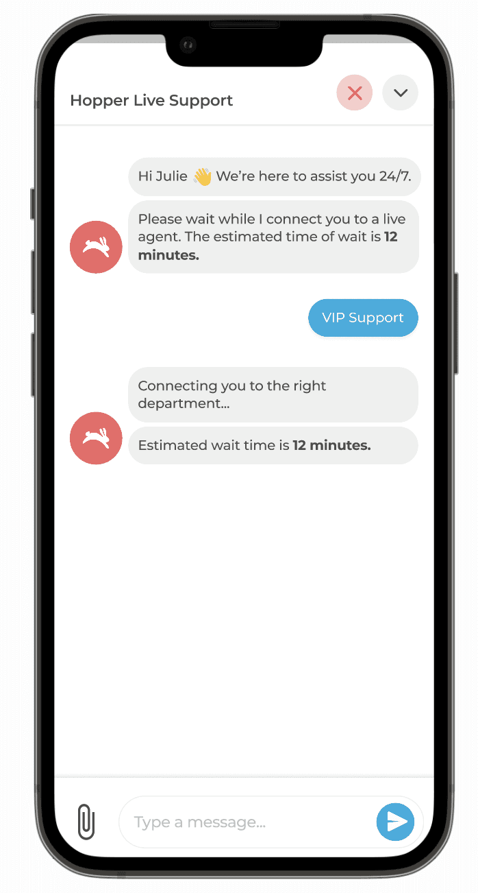
Integrating automated messages in the live chat feature to assure users of their redirection to a live agent.
Implementing an estimated wait-time indicator in the live chat feature to manage user expectations.
DESIGN
Having gathered all the insights from the research to the ideation phase, I proceeded to wireframe the solutions. Following this, I validated the designs by conducting another usability study, involving the same participants as in the initial study.
USABILITY STUDY
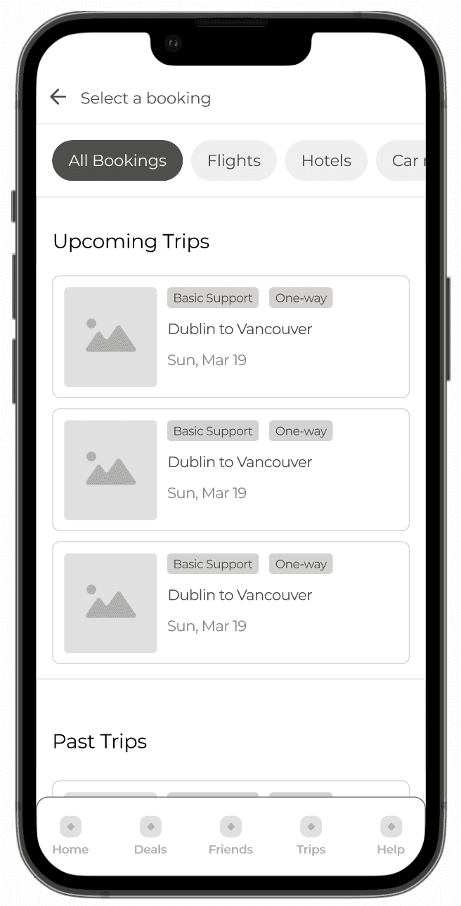
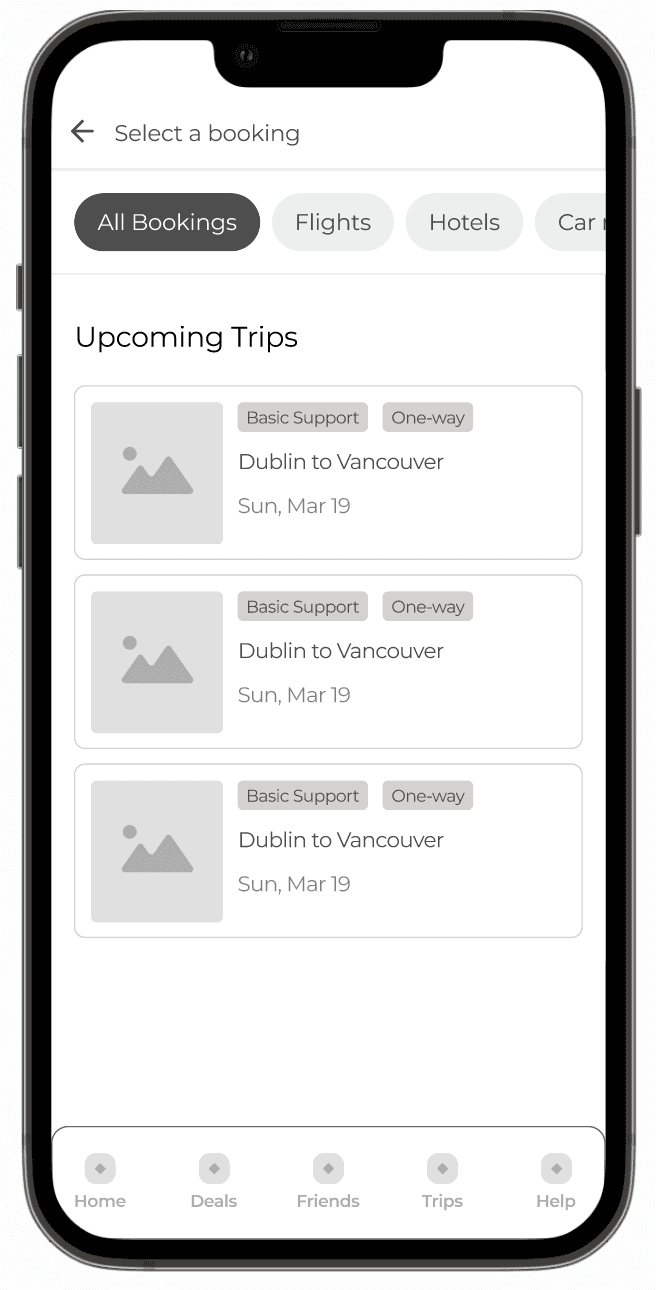
In a second usability study, the same users tested new designs via two prototypes - one with bookings, and one without. They performed identical tasks as before - locating the help centre, accessing information, and seeking agent help. In the 'with booking' prototype session, user task completion improved.
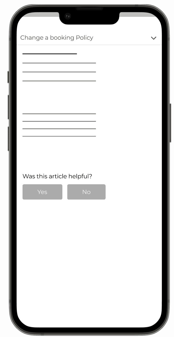
Users found FAQ info and assistance areas easily and appreciated the live chat's clear wait times. However, 40% of users recommended retaining the 'see past conversations' feature, finding it helpful. On the other hand, in the 'no booking' prototype session, 60% of users were confused about how clicking the 'Change a Booking' button led them to the booking policy.
To align with our goal of increasing customer retention, I recognized the importance of retaining crucial features and design elements to maintain user familiarity with the app.
While designing the page, I recognized users expected to see bookings, not policy information. After reassessing user expectations, I decided to clarify to users without bookings that there's nothing to modify, instead of directing them to the policy.
FINAL DESIGNS
Using Figma, I created mock-ups and high-fidelity designs that align with Hopper’s design system.
RESULTS AND TAKEAWAYS
I continued to test the new prototypes with more users. Based on their feedback and my observations during the usability studies, it appears that the new designs could potentially decrease the number of complaints about customer service and increase user satisfaction.
In addition, I received a lot of positive feedback from users about the new designs, specifically, the newly added feedback on the live chat, saving users time and frustration.
Some key takeaways from this project:
Balancing innovation and familiarity - The decision to retain some aspects of the previous design for user familiarity was a strategic move that took into account how people react to change.
Value of iterative design - The project made me realize how important it is to iterate designs based on user feedback. The first solution might not be always the best one, but with iterations and user-considerations, I was able to improve user experience.
Effective communication - This case highlighted how clear communication within the interface can significantly improve the user experience. The second usability study clearly demonstrated how miscommunication between the technology and the user can affect the overall user experience.


