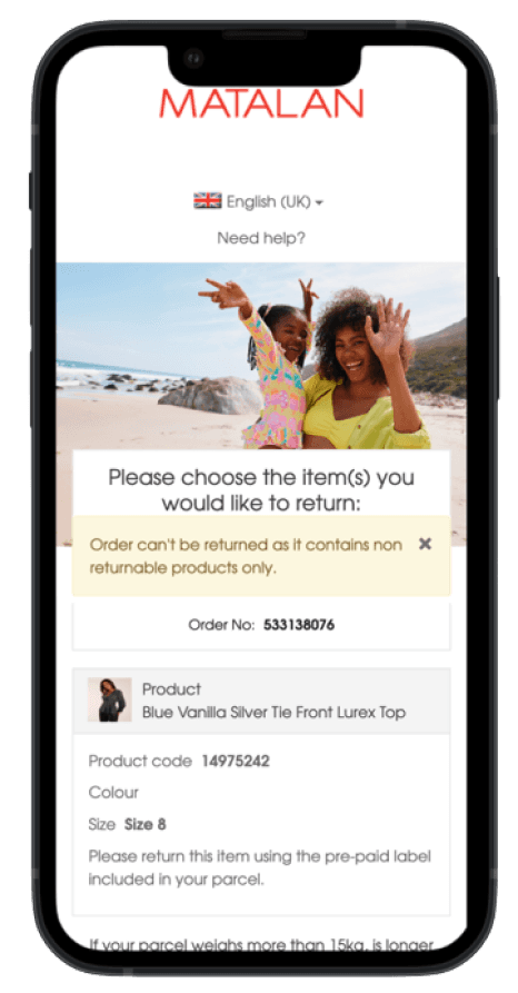
This project was initiated after Retail Ops noticed an increasing number of dropship product returns in-store. They requested UX support to investigate user journeys on the site and implement necessary changes. After meetings with various teams—including marketing, buying, customer service, and retail ops—we realized the problem was more complex than initially thought, requiring a quick and effective solution.
The goal of this UX case study is to identify and address the root causes of customers attempting to return dropship products in-store at Matalan.
TEAM
Alexis, UX Designer
Jovie, Senior UX Designer
Matt, Web Analyst
UNDERSTANDING THE PROBLEM
I was assigned to lead this project, and after working with various teams, I realized I needed to approach the problem with a broader perspective, examining not only the online user journey but also the entire customer experience across both digital and physical touchpoints.
Understanding the complexity of this project, I created research goals and methodologies to break down this complex problem into manageable subproblems.
RESEARCH GOALS
QUANTITATIVE DATA
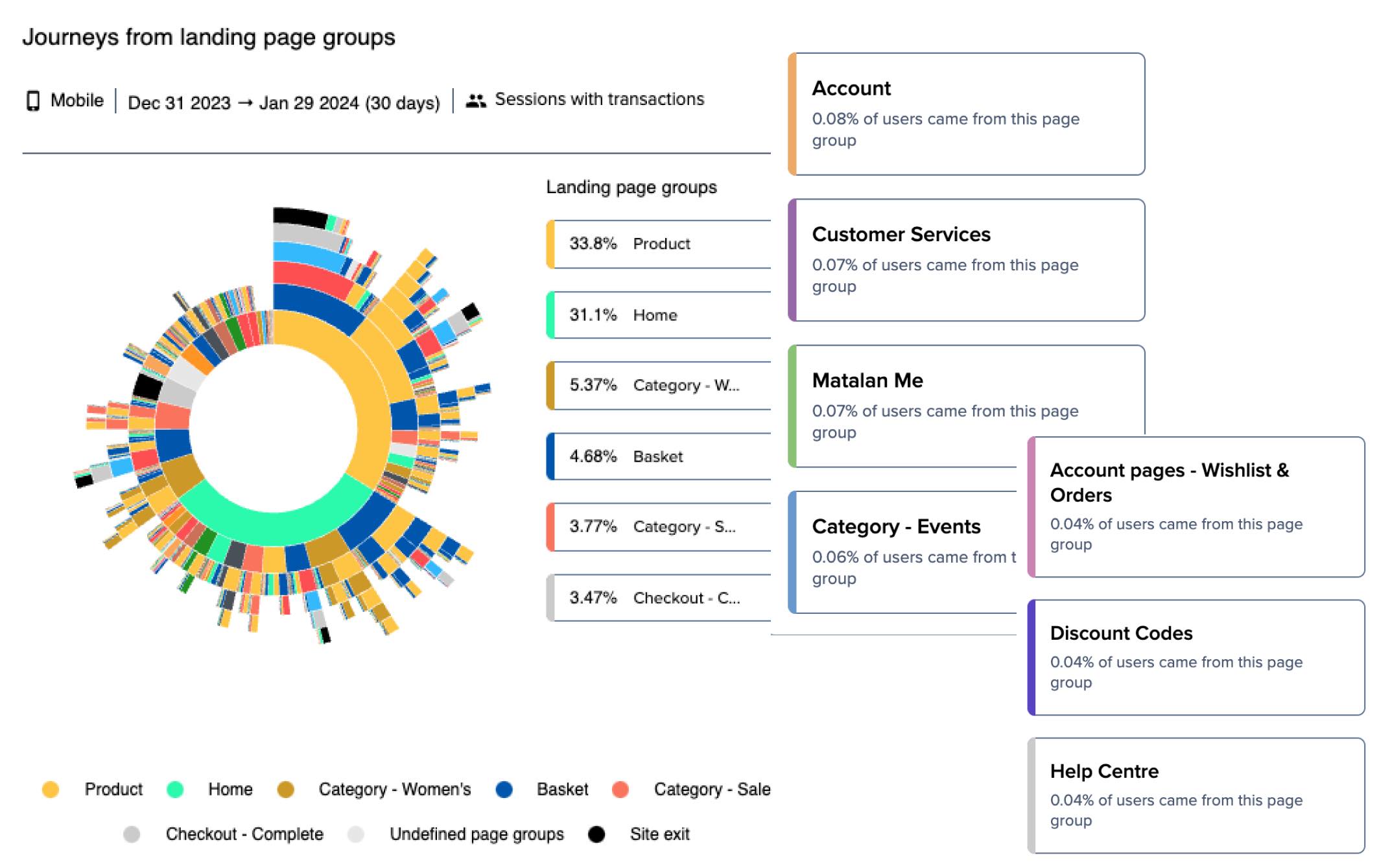
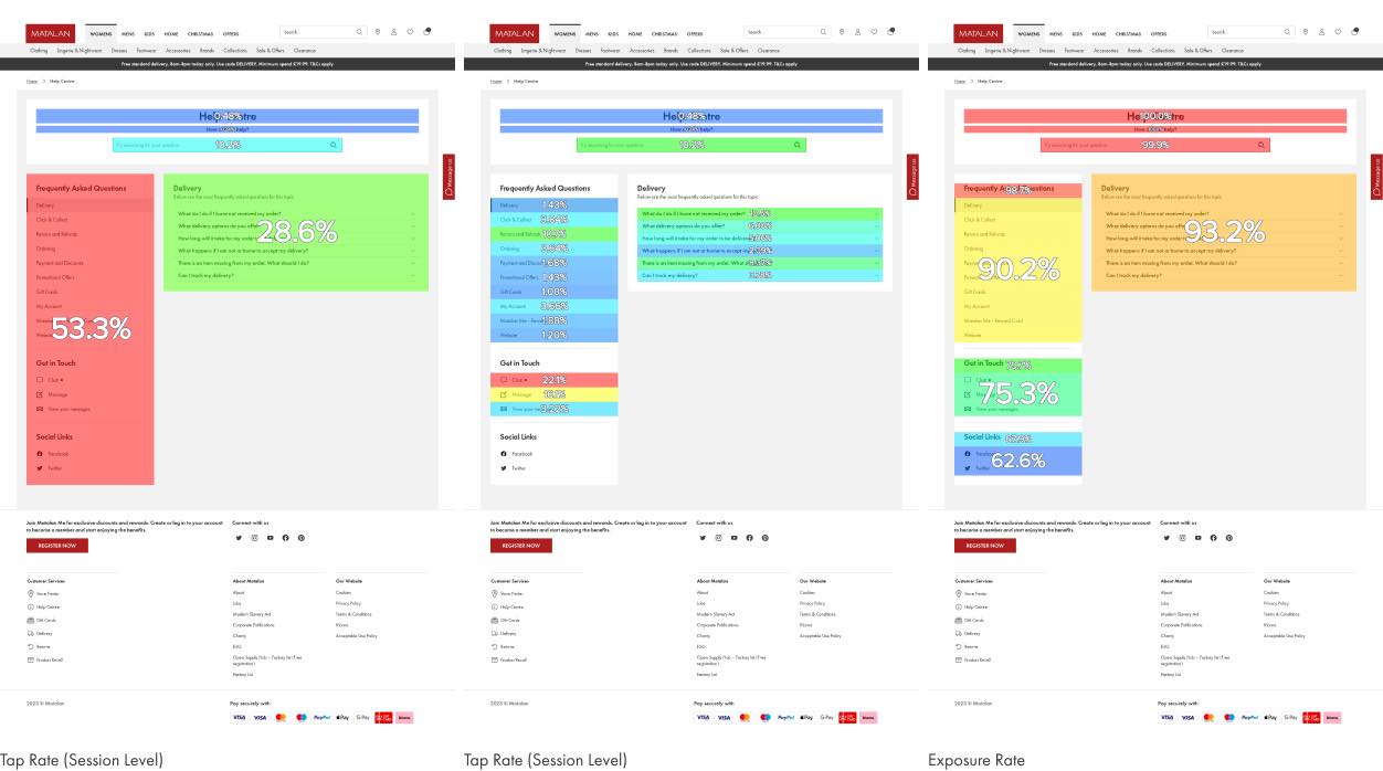
For quantitative data, we used ContentSquare to look at the user journey using features like session replays, journey analysis and zoning analysis. We analyzed each core page on the site to gain broader insights into how users make online returns. We focused on understanding how users browse information and how the current user flow affects their comprehension of Matalan's return policy.
Zoning, journey, and session replay analyses have revealed that users often visit the returns page but are unable to differentiate between dropship and Matalan products, assuming their return processes are the same.
QUALITATIVE DATA
We also looked at what our customers say on TrustPilot to identify common pain points our customers experience. We believe that when customers take time sharing their thoughts online is that they are either very happy with their purchase or the opposite.
GATHERING INSIGHTS
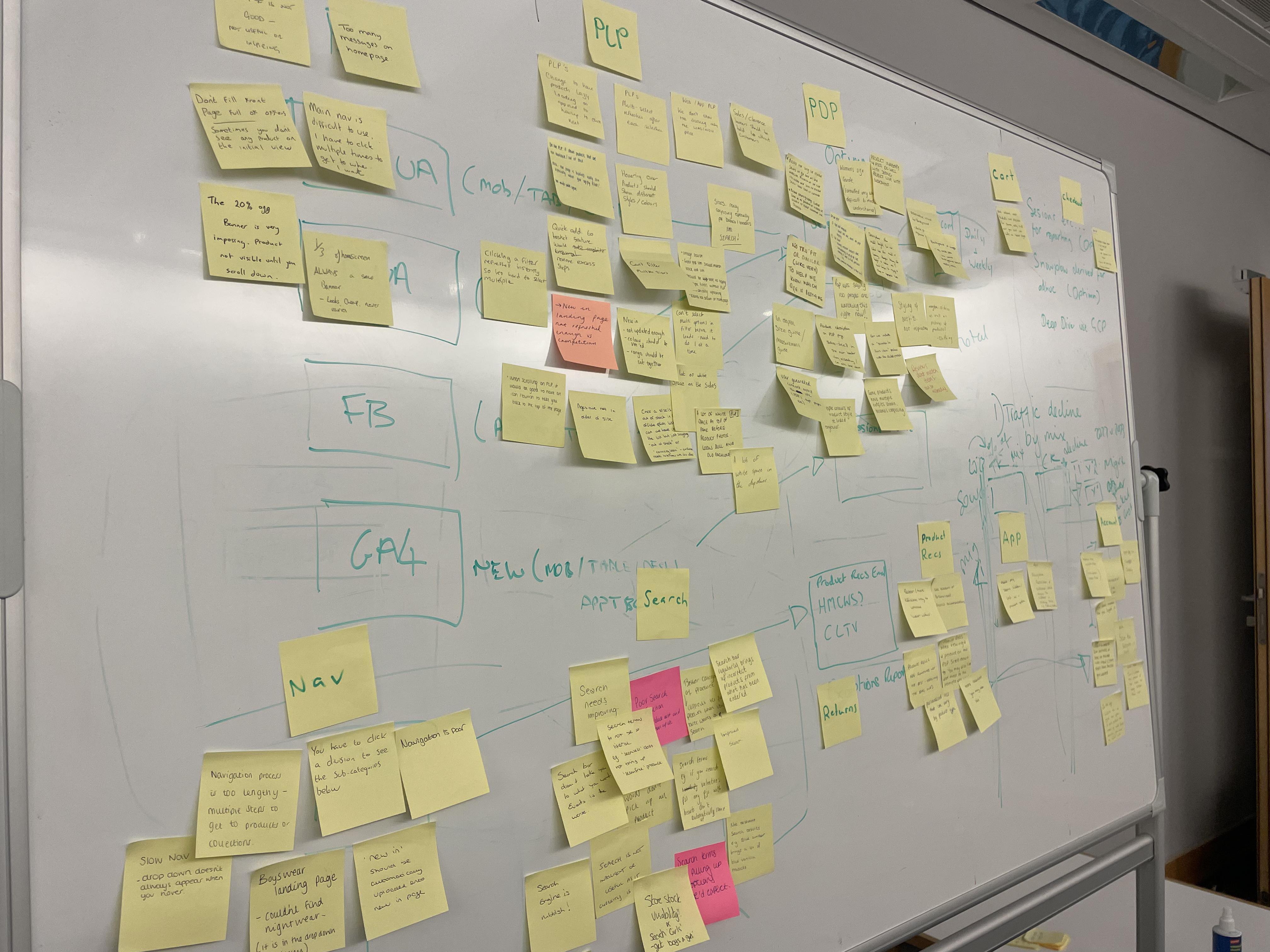
After collecting all the data, I conducted an affinity mapping with my teammates to synthesize the pain points identified. We grouped these problems under common themes and features in the platform.
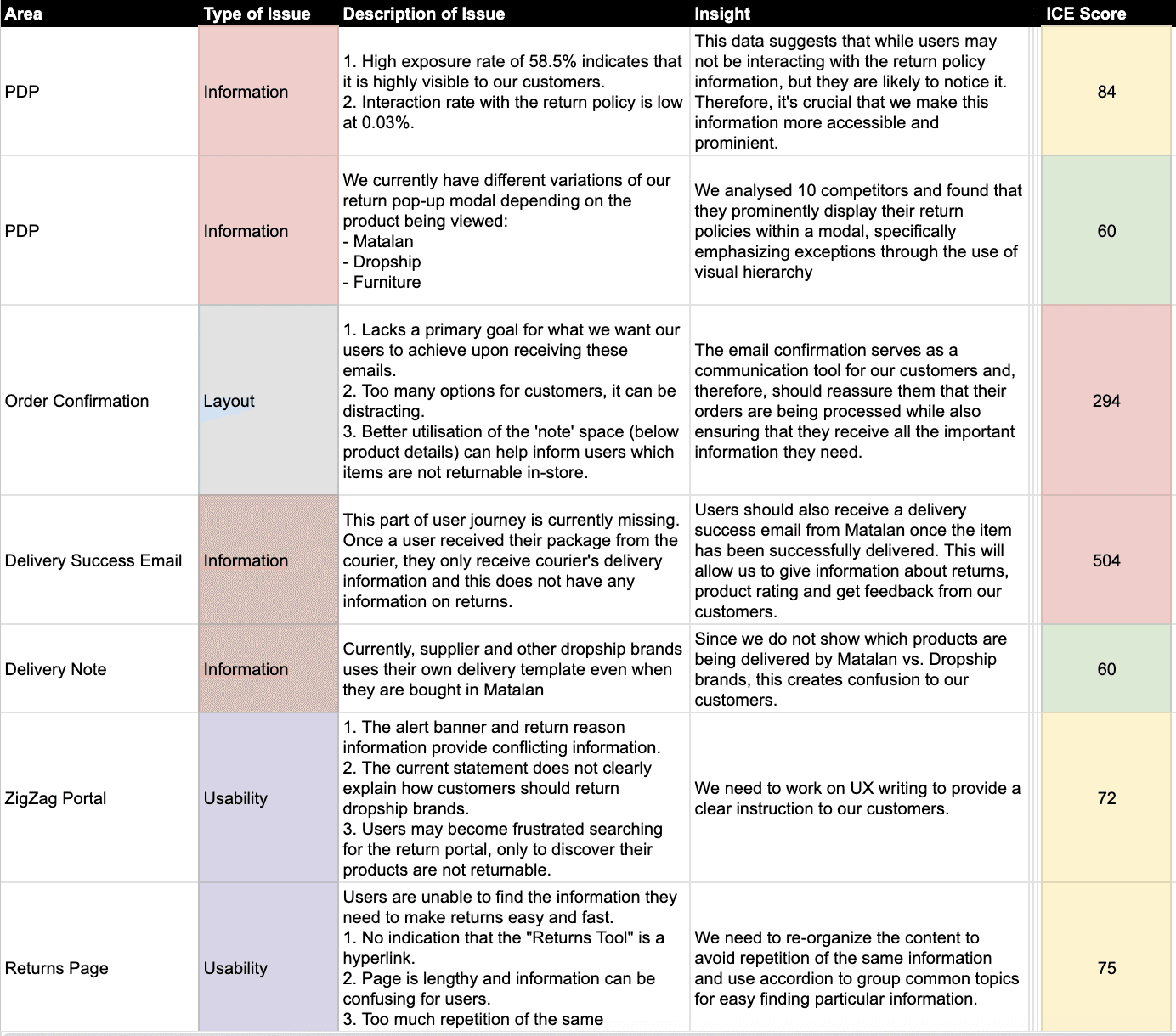
I relied on a data-driven approach called "ICE scoring model" to help our team simplify, compare and prioritize different ideas.
PRIORITISATION OF ISSUES
Given the high severity level of our marketing emails on the prioritization framework, I initially focused on this area. For each area, I analyzed competitors, particularly those with dropship brands, to identify their strengths, weaknesses, and opportunities for us to differentiate.
Branding, Marketing, and UX team concluded that addressing the marketing emails would have the highest impact but requires engineering effort to review and implement. Although we lack in-house developers, our partnership with THG should provide the necessary resources.
NARROWING DOWN KEY DELIVERABLES
After mapping our post-purchase customer journey, I analyzed our email confirmation structure, focusing on improving transparency around the return process for dropship brands. I then initiated a team workshop to brainstorm solutions and discuss the constraints and efforts involved in implementing them.
In collaboration with the branding and marketing team, we have defined the following key information and desired user journey for our customers making returns. We will improve these qualities in our site:
UX Writing: Using straightforward language and avoiding jargon will make it easier for users to understand the return process.
Information Architecture: Organizing return information logically and placing it in prominent locations will help users find what they need quickly.
Familiarity: Using consistent design elements throughout the website and return process will make it easier for users to recognize important information.
APPLYING SOLUTIONS
After finalizing timelines and ownership, the UX team created mockups and prototypes to visualize and compare the current state with our proposed improvements.
DEVELOPING THE DESIGNS
After getting my high-fidelity designs approved, I shared them with the relevant teams responsible for building and delivering the final product.
I worked closely with each of these respective teams and participated in weekly calls to ensure progress on these tickets. For the front-end tickets, I conducted a UX review of each implementation to ensure it aligned with the designs before going live.
RESULTS & TAKEAWAYS
Since these changes were implemented, we've seen an enormous decrease in in-store returns. Additionally, we have received more positive feedback from our customers regarding transparency of returns. Although there are still frustrations from this friction, customers appreciate the transparency and honesty from Matalan.
Some key take aways from this project:
Complex project requires strategic planning: Initially, I felt overwhelmed with the amount of work that needs to be done to ensure we look at every touchpoint in our customer journey, from online to physical stores. Strategically planning helps me establish what is important and how much impact MVPs can have in alleviating customer frustration.
On-going project: This project doesn't end with user testing after development. It takes a while to get accurate data because of our return policy window, so customer returns can vary.
Team management: This complex project taught me how to collaborate effectively with diverse teams, listen to different perspectives, and develop essential leadership skills such as resource allocation, communication, and task delegation.

